

Armor of God Logo and Branding Project
Armor of God is a young apparel company from Trinidad and Tobago. Their name was inspired from the bible verse "Do not be afraid,...I am your shield" from Genesis 15:1. With this as a base, the owners had the idea of selling clothes with bible verses on them so people who are believers in the Christian faith would feel protected from harm when they wear these clothes, hence the name, Armor of God.
Guidelines to Follow
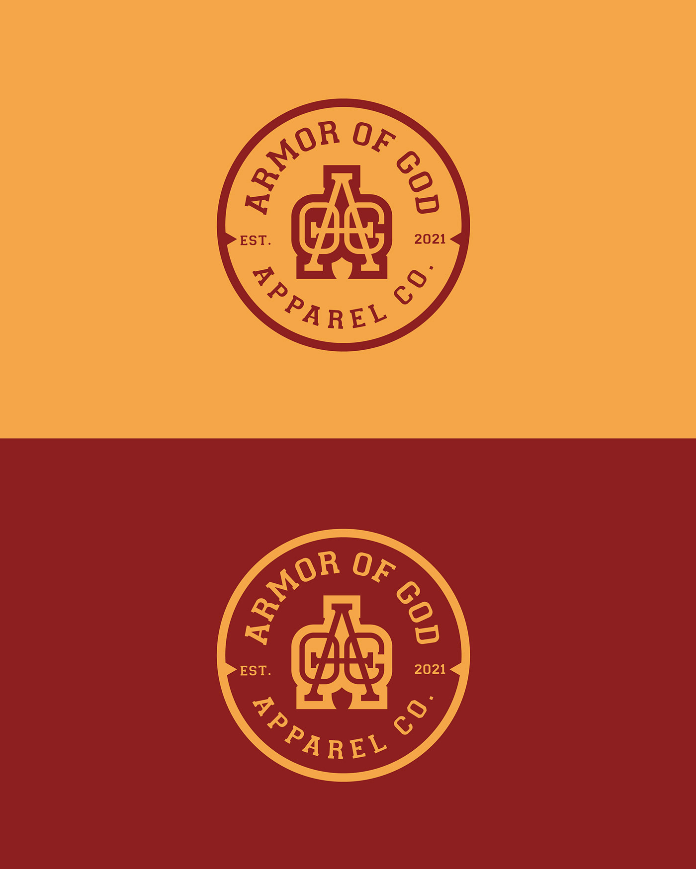
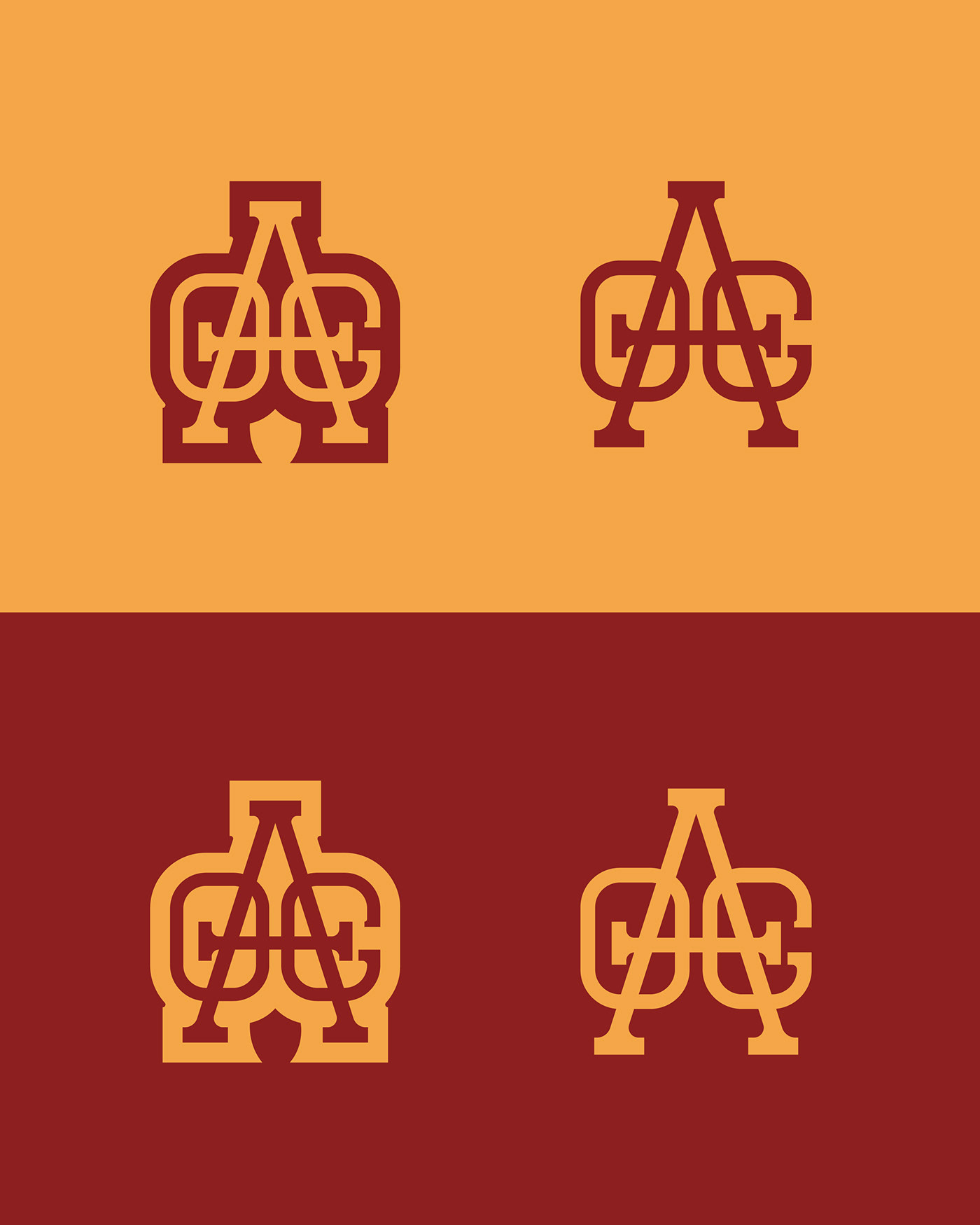
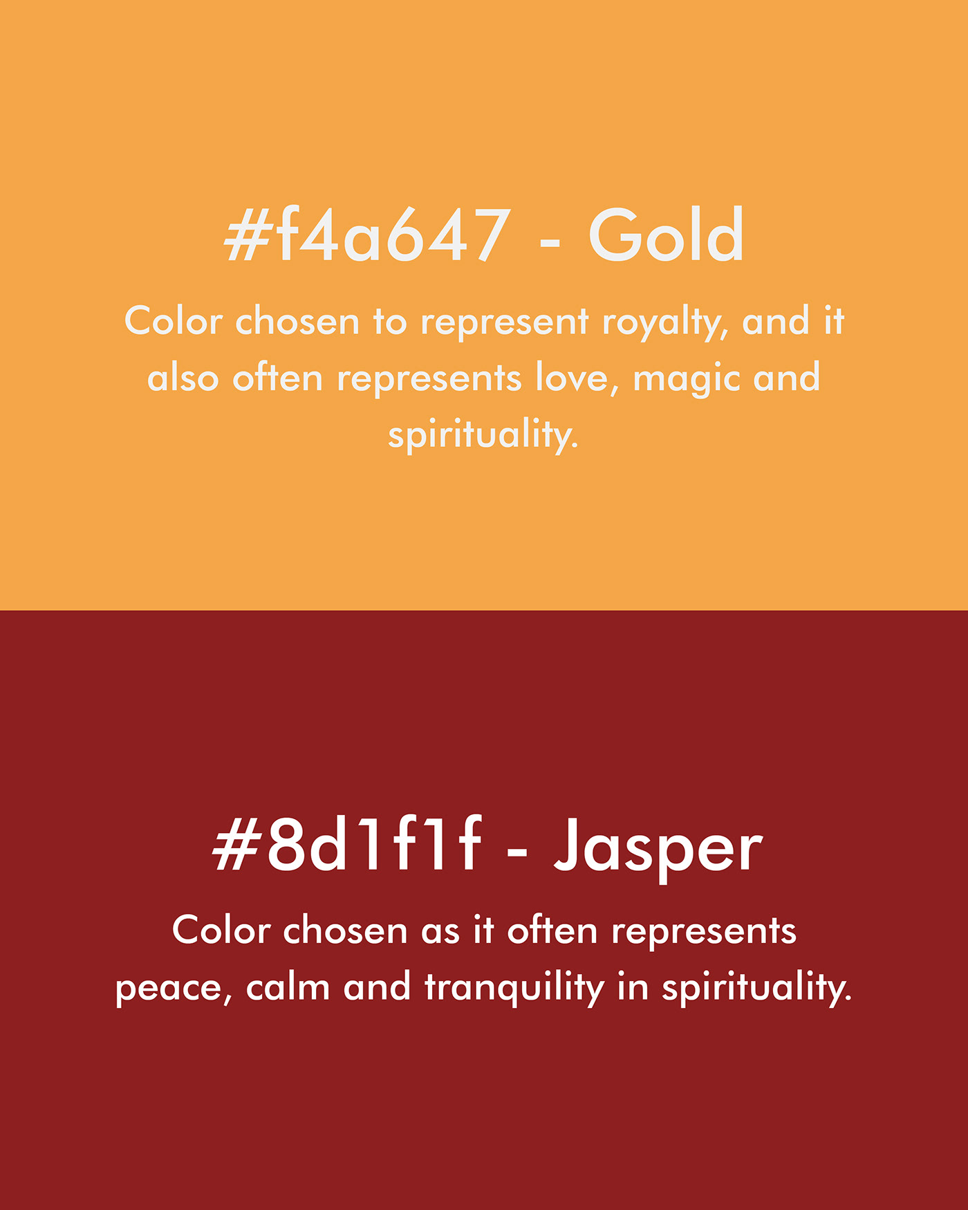
The only guidelines I had to follow were using the colors gold and jasper. Naturally I asked what is the purpose of the colors and what versions of these colors that they would like me to implement. They explained the reasons behind the colors and left the shades up to me.
My Thoughts of the Project
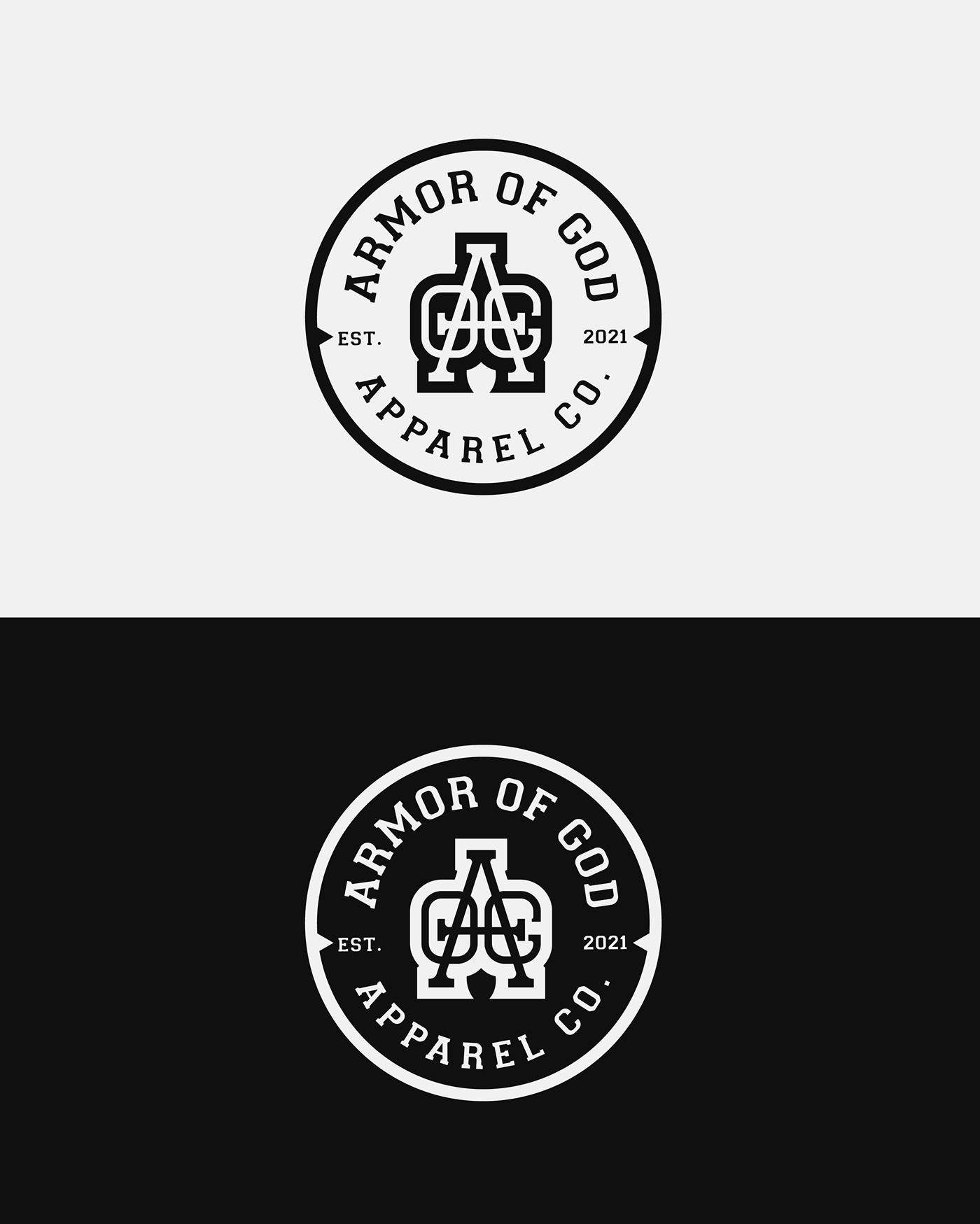
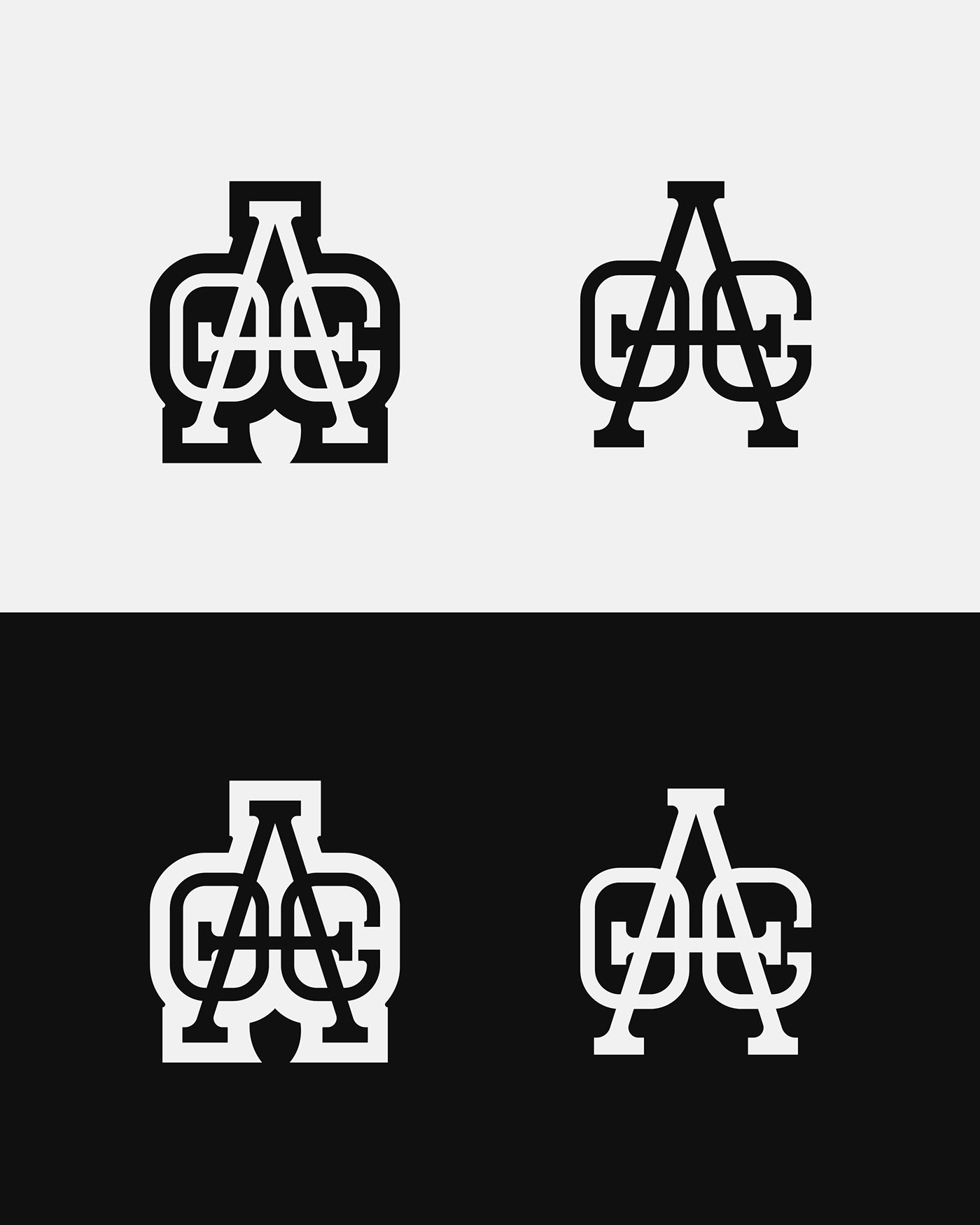
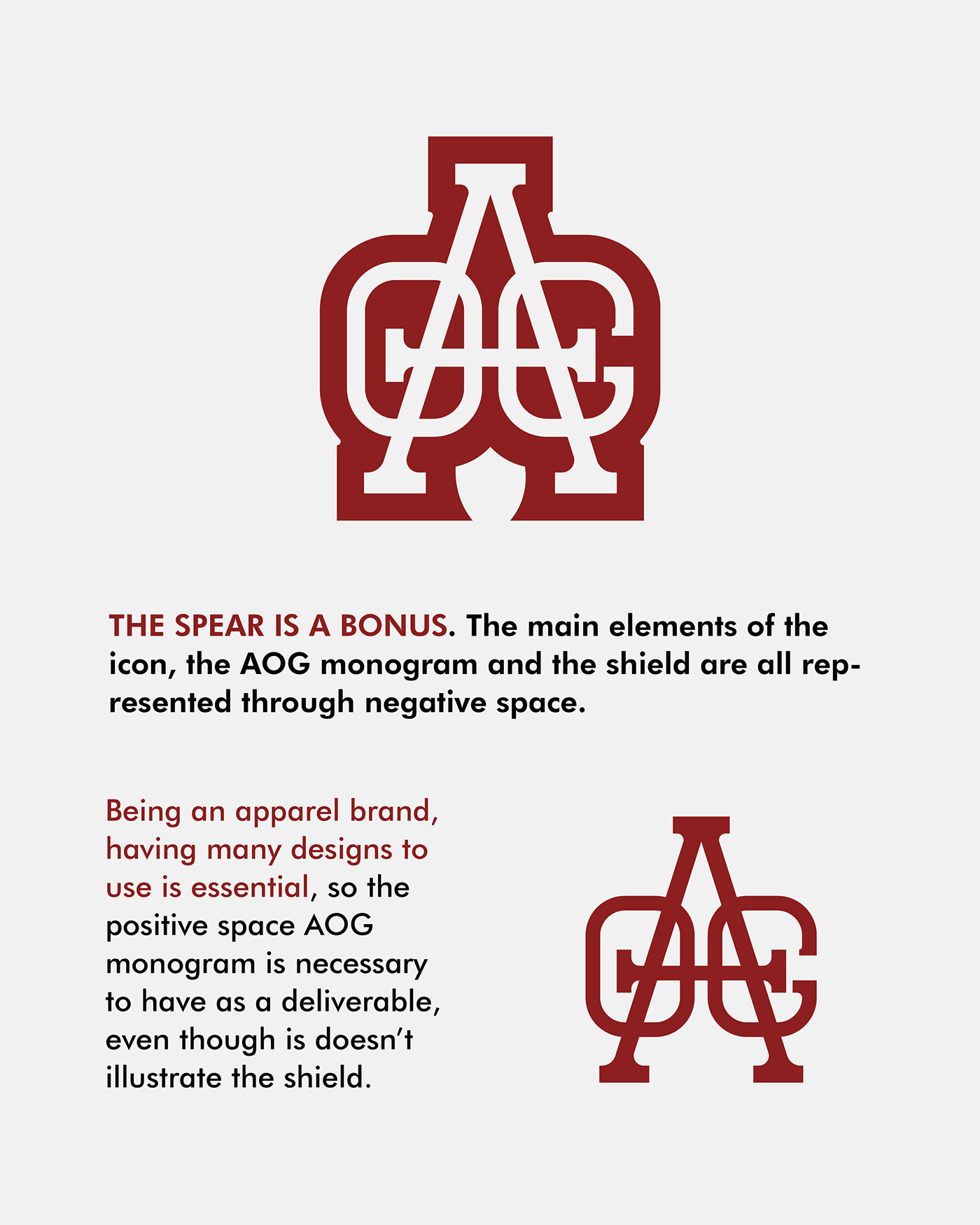
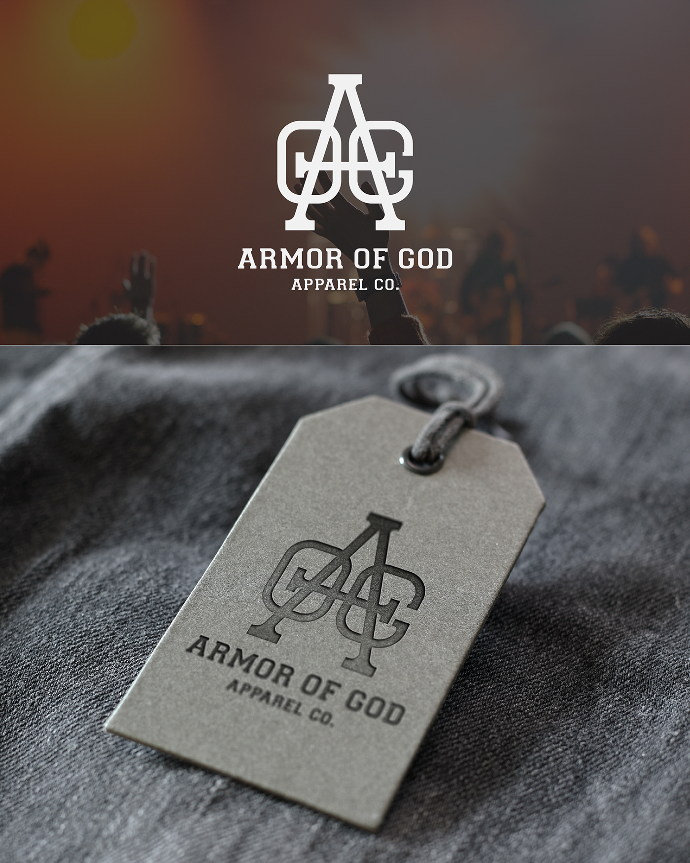
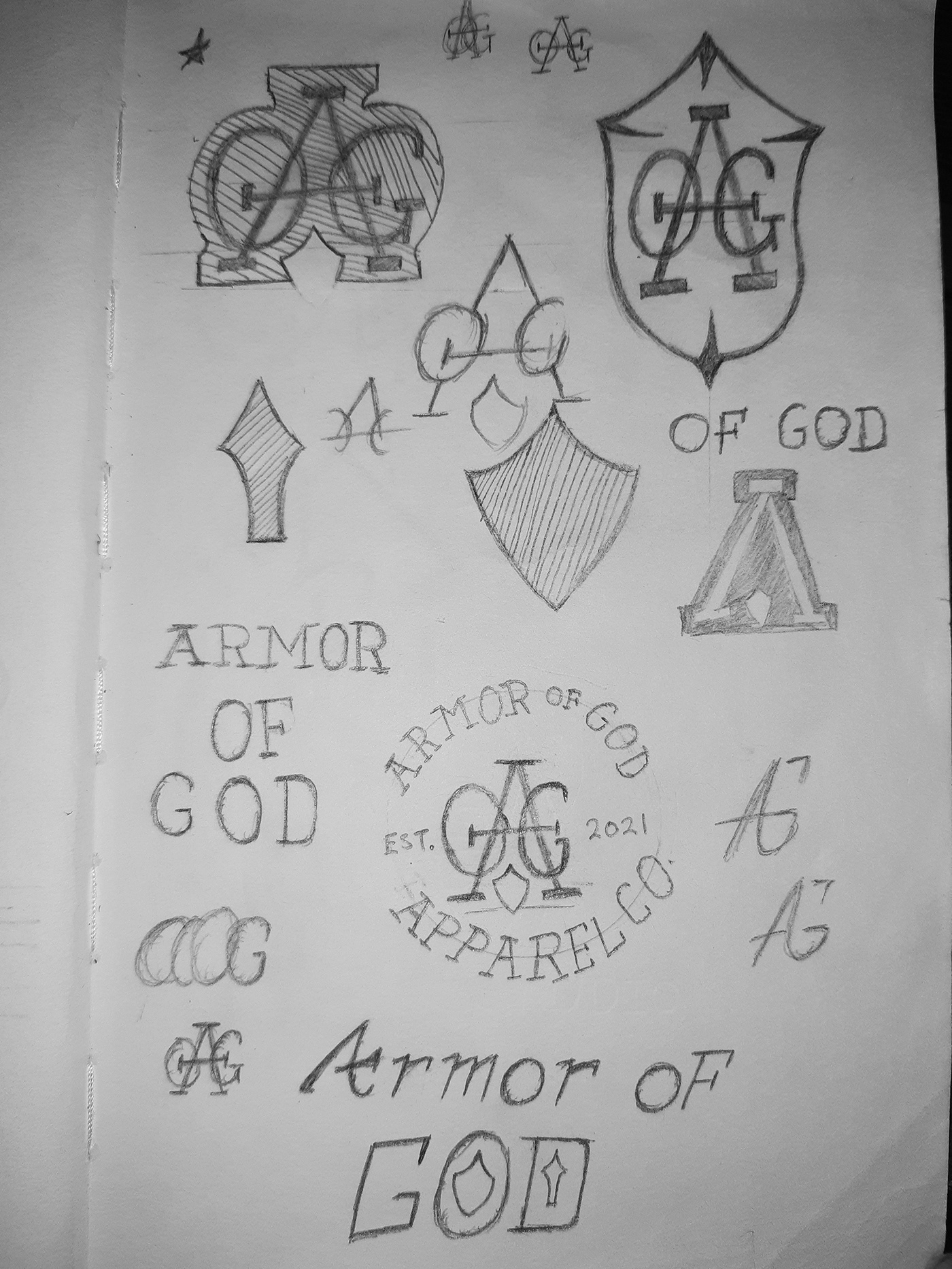
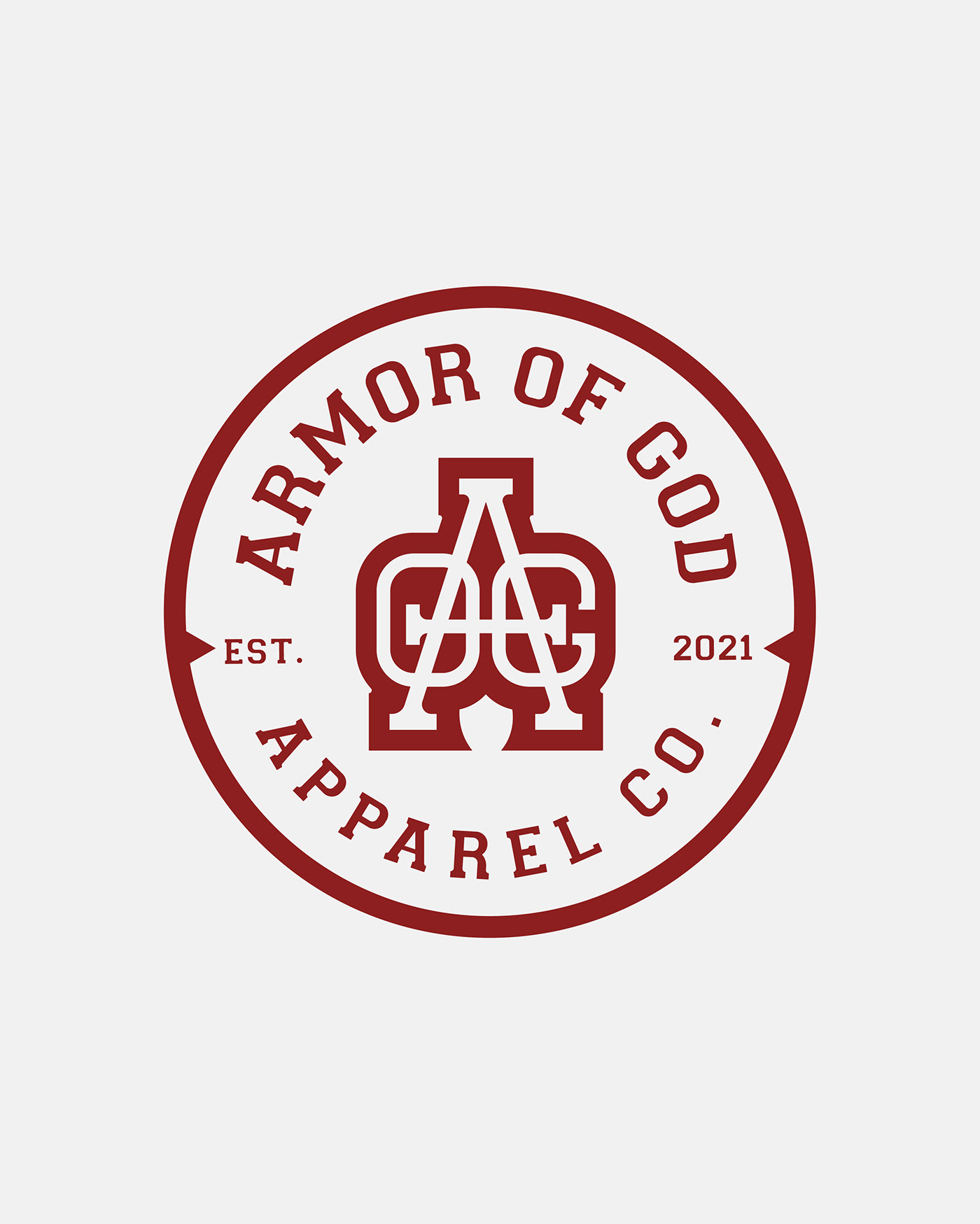
Whenever I am commissioned to design a logo for a business who name has three words I automatically think of ways to make a monogram of the the initials. As I was given creative liberty to make the design how I see fit, I started sketching different monograms. Next, an apparel company, obviously needs multiple designs at their disposal, so I'm thinking the logo should be able to be used in its entirety and have an icon that can stand on its own.
Challenges
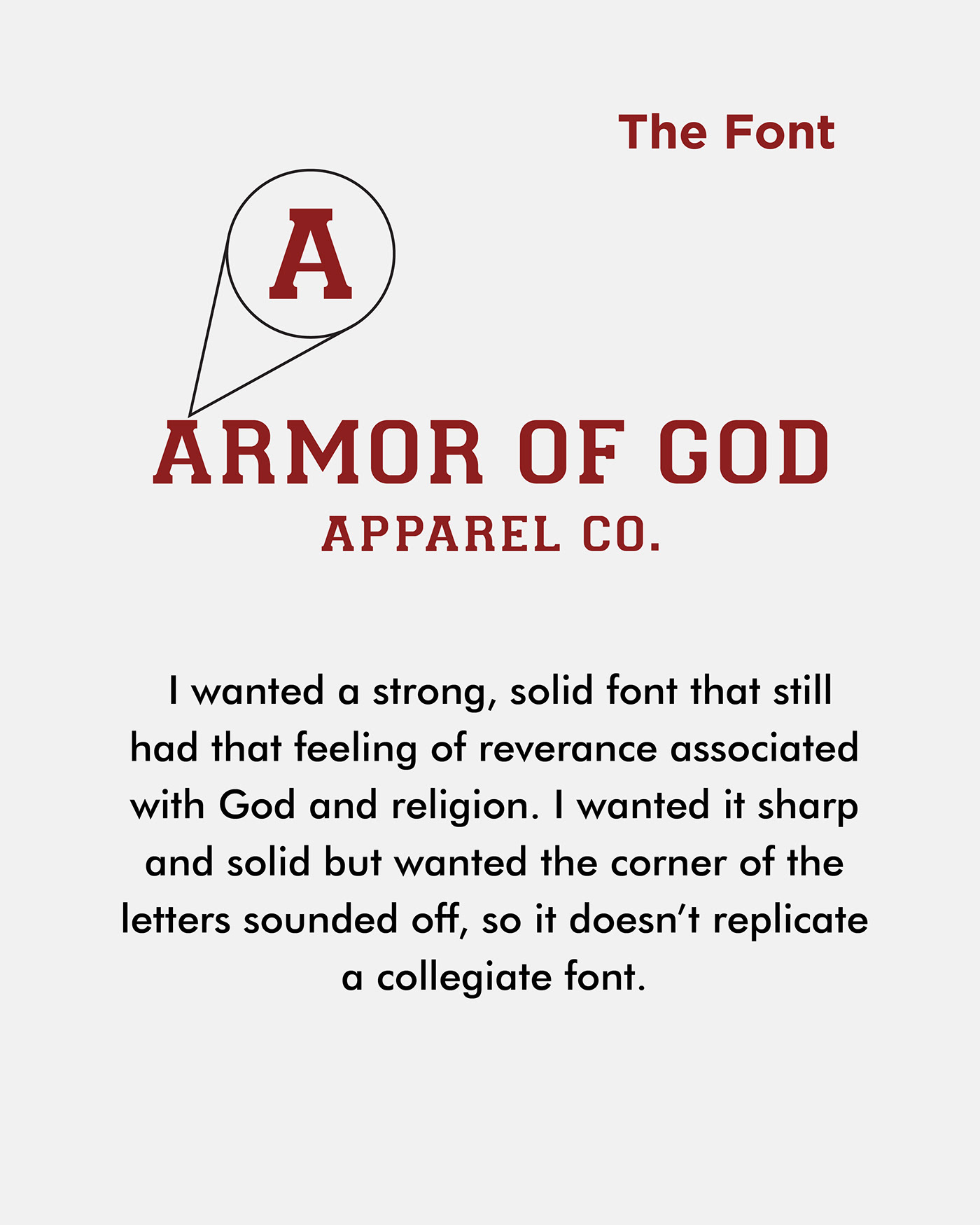
I wanted to represented "Armor" in a creative way. In the beginning I tried to make an emblem logo, with the shield being big and bold. However I wasn't getting the design right, so I took a step back and decided that less in more, and aimed for more subtle symbolism.


I thoroughly enjoyed working on this project for the great people at Armor of God. View my profile on Instagram (instagram.com/meloskin_graphics) for an extensive view of my work.
Take care my fellow creatives!


